Understanding the Challenge
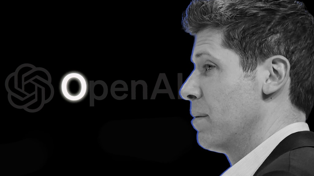
Creating a logo for AI companies is a complex task. Unlike traditional brands, AI lacks a clear visual representation. OpenAI is currently navigating this challenge, particularly with a proposed new logo—a stark black “O.” This design has faced backlash from employees who find it “ominous” and disconnected from the hopeful image that AI should convey. The logo redesign is part of a broader shift within OpenAI, which includes changes in corporate structure and a focus on profitability.
Key Insights
- OpenAI has been working on a new logo for a year, aiming to reflect “precision, potential, and optimism.”
- The current flower-like hexagonal logo contrasts sharply with the proposed minimalist design.
- Employee dissatisfaction highlights the risks of a logo that may evoke negative associations with AI.
- The redesign coincides with significant changes in the company’s governance, moving from a nonprofit focus to a for-profit model.
Importance of Perception
The logo is more than just a symbol; it represents the company’s identity and values. A logo that feels threatening could alienate users and reinforce fears about AI’s capabilities. As OpenAI navigates these changes, the logo’s design will play a crucial role in shaping public perception. Balancing a modern aesthetic with the need for trust and safety is essential for the future of AI branding.